DIGITAL
DESIGN.
Interface design, user experience, visual identity and digital brand systems that make a product easier to understand, easier to use and much more memorable.
MEETS
FUNCTION
Digital experiences with a clear visual point of view.
Website & App UI
Interface systems for websites, dashboards, portals, admin tools and custom web applications.
User Experience
Flows, page hierarchy, interaction states and task design focused on clarity rather than decoration.
Digital Identity
Color, typography, imagery, graphic direction and usage rules for a consistent online presence.
Design Systems
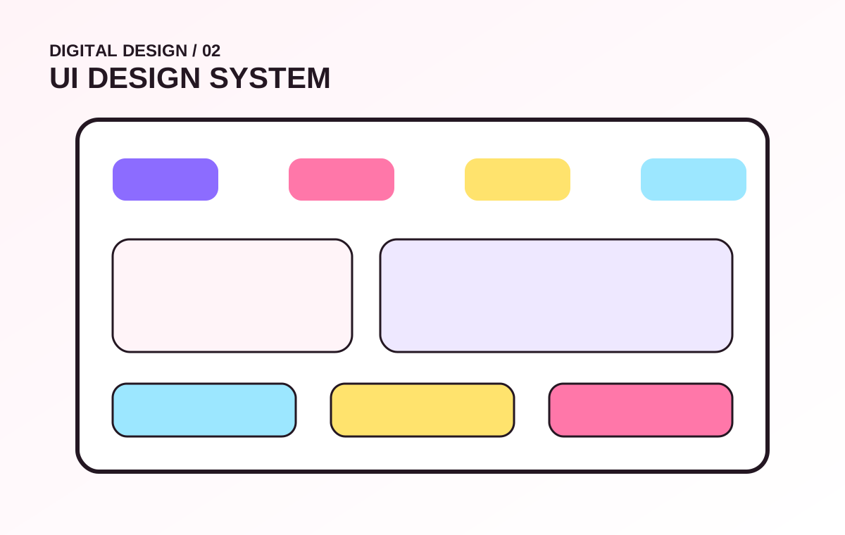
Reusable components, spacing, states and patterns that keep future screens consistent.
Interactive Prototypes
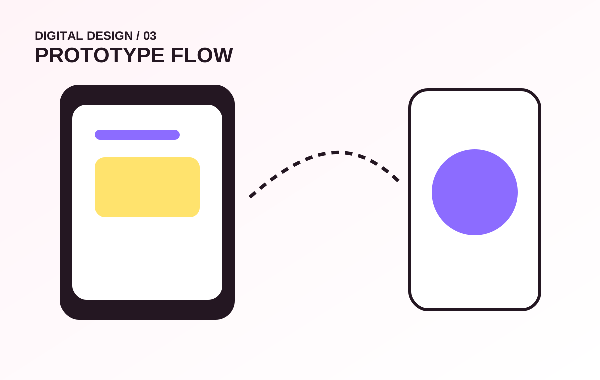
Clickable flows to validate navigation, interactions and stakeholder expectations before development.
Interface Refresh
Modernise an existing digital product without losing the useful structure and content already in place.
A design should feel intentional everywhere.
System ingredients
- Typography hierarchy
- Color roles and contrast
- Spacing and grid rhythm
- Buttons, forms and controls
- Cards, tables and data states
- Navigation and responsive patterns
- Motion and hover behavior
Experience principles
- Important actions stand out
- Content remains easy to scan
- States communicate what is happening
- Mobile layouts are not an afterthought
- Consistency reduces user confusion
- Visual personality supports credibility
- Accessibility is built into decisions
Color is a system, not just a preference.
We design the awkward moments too.
Empty States
Guide the user when there is no content yet instead of showing a dead blank area.
Loading States
Keep the interface understandable while data or actions are still in progress.
Error States
Explain what failed, what the user can do next and how to recover.
Validation
Show requirements and mistakes clearly without forcing the user to guess.
Focus & Keyboard
Design interactive elements with visible focus and logical navigation order.
Touch Behavior
Give controls enough space and avoid desktop patterns that break on small screens.
From rough idea to build-ready screens.
Understand
Users, goals, content and constraints.
Structure
Flows, sitemap and wireframes.
Explore
Visual direction and key screens.
Systemise
Components, states and responsive rules.
Prototype
Interactive review and handoff.
What the project can include.
Design files
- Wireframes
- Desktop and mobile UI screens
- Reusable design components
- Interactive prototypes
- Style / design system reference
- Developer handoff notes
Brand support
- Digital color system
- Typography pairing
- Icon direction
- Image treatment
- Social / web visual templates
- Usage consistency rules
More visual depth, less wall of text.
Common questions.
Can design be done before coding starts?
Yes. That is usually preferable for larger projects because flows, layouts and interaction decisions can be reviewed before development time is spent.
Can you redesign only selected pages?
Yes. A redesign can focus on the highest-impact pages or a specific portal/module rather than replacing everything at once.
Can the design be handed to another developer?
Yes. Deliverables can include structured screens, components and notes intended for implementation by another developer or team.